
I was so excited to be able to pre-order from the Occasions Mini Catalog AND earn some
Sale-a-bration items as well!
This Sale-a-bration DSP and brads I LOVE! I decided to start on my swaps for Leadership convention (this will be my first SU event and I am not sure what I am doing)
I planned out the card and started cutting paper and assembling the base of the card.
Loved the papers together....
After I did 10 or so of the bases I started on the framelits and coordinating stamp...
I put it together and thought .... ick

It didn't turn out at all like I had planned in my head.
There was no way I was making 10 of these. They were ugly.
So I had to have a plan B.
I loved the base papers and the color combinations...
it was the stamped image I hated...
not really, just the BLACK ink!
Ahhhh ..... a solution is at hand!
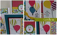
Behold...

Isn't it so much better when I use the correct ink color?
The point of all of this?
If you ever run into this situation where you create a card that should be stunning (at least it was in your head) take a minute to think about what bothers you, and see if it is a simple fix.
I feel lucky that I only made two of the top ones and I have 8 of the revised card.


5 comments:
Gorgeous card Joanie. Love your work.
Wow! Joanie! I love them both! Totally different looks but both great!
both are beautiful, i think! i hate when i imagine something perfect and it looks nothing like i wanted!
-rachel w k
rwkrafts.blogspot.com
What a good lesson. Both cards are stunning, but I know what you mean about not liking the appearance of the finished product that you had so carefully visioned in your head.
Post a Comment
Note: Only a member of this blog may post a comment.